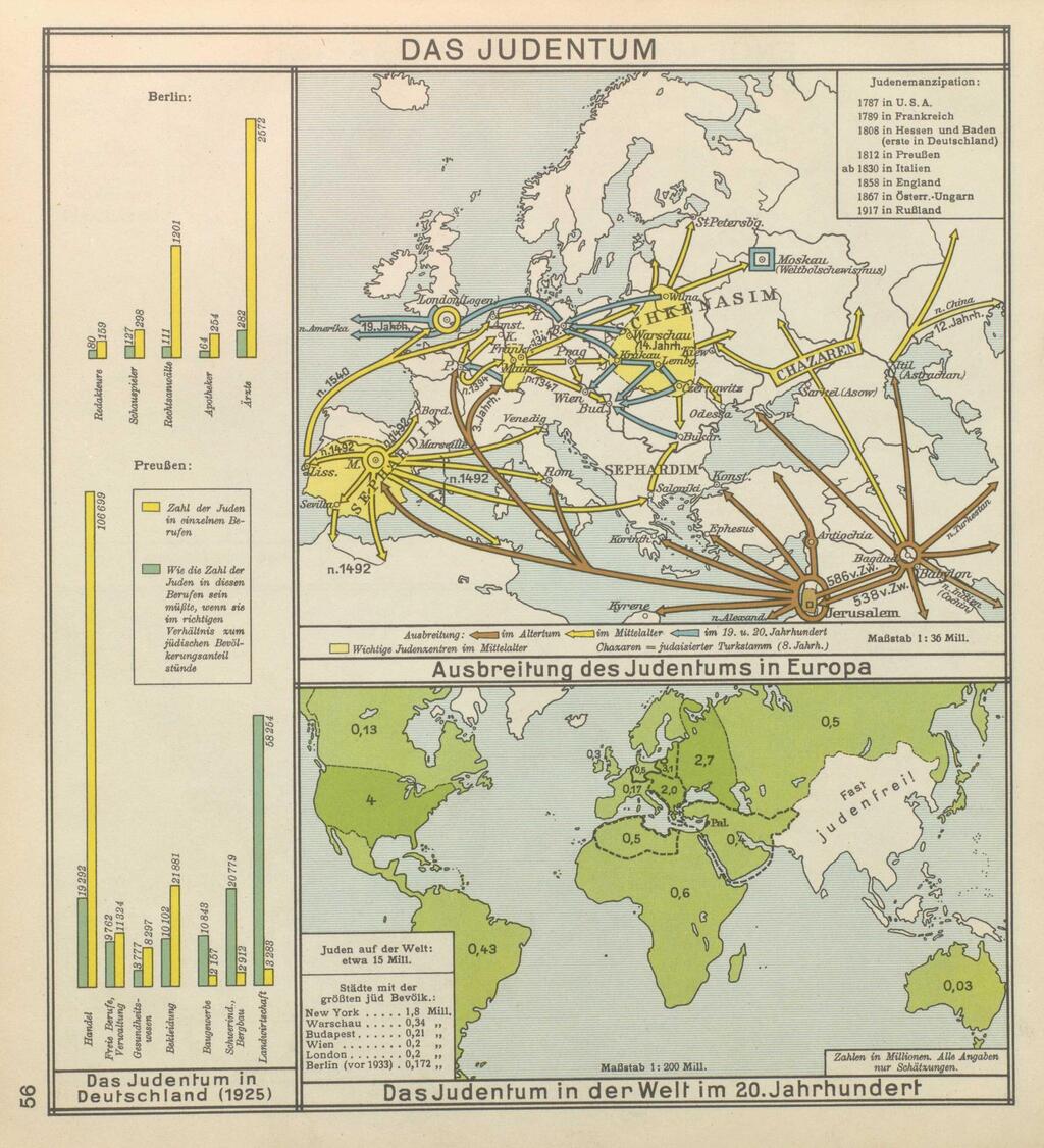
From the late 19th to mid-20th century, maps depicting Jewish migration were crafted with antisemitic undertones, portraying their movement as a spreading plague, according to a new study by Dr. Zef Segal, a senior lecturer at the School of Media Studies at the College of Management Academic Studies.
His findings, set to be published in the Patterns of Prejudice journal, reveal that such maps appeared not only in Germany, where antisemitism peaked during the Holocaust, but also in the UK. “Maps are never neutral,” Dr. Segal told Ynet. “They reduce a complex, three-dimensional world into a two-dimensional medium, omitting details and using graphics to convey a message.”
Unlike modern maps oriented north due to compasses, ancient maps placed east at the top, derived from the term “orient,” meaning to navigate by the east. Historically, Jerusalem and Israel were central to many maps. In the pre-GPS era, car company-sponsored maps emphasized roads over trails or public transport, subtly prioritizing car travel.
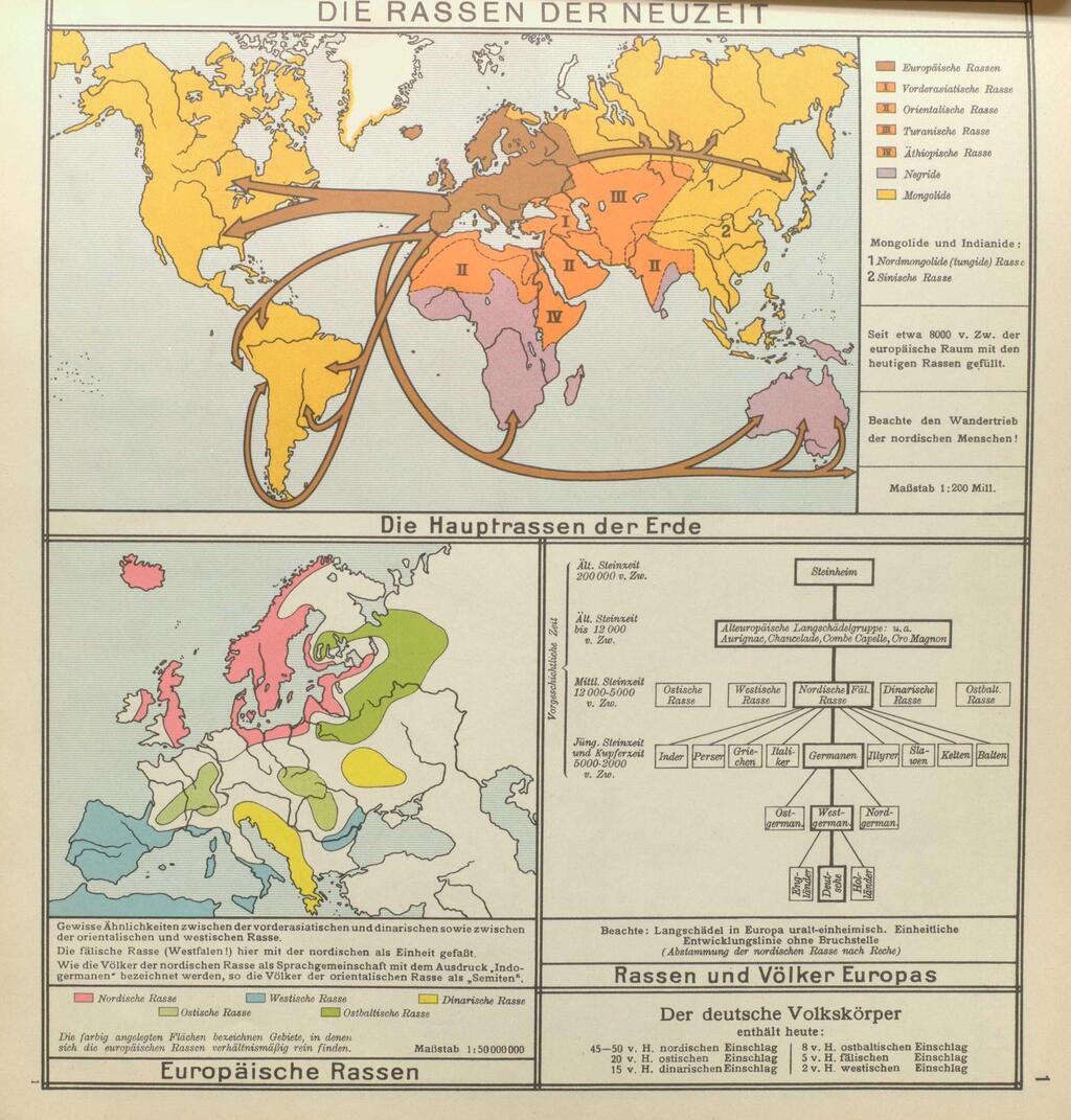
Segal’s research began with 19th-century maps categorizing races and religions, such as “dark-skinned” Africans or “yellow-skinned” Asians, depicting white expansion through pink-colored colonial “fingers” while portraying other groups as static. Surprisingly, Jews were rarely marked despite significant populations in Poland and Hungary.
“Maps and graphics built hierarchies and prejudices,” Segal explained. Africans enslaved in the U.S. appeared as dotted mixed-race areas, but Jews were absent until later, when they were marked with dots or shades resembling disease maps, like cholera or fever. By the late 19th century, migration maps used arrows to show white movement outward, while later maps depicted Jews "infiltrating" Europe, reinforcing harmful stereotypes.
In Germany, post-World War I Nazi propaganda contrasted “wandering” Aryans with Jews, depicted in a 1938 atlas as moving inward to Germany and beyond, like a “dangerous plague,” Segal noted.
Get the Ynetnews app on your smartphone: Google Play: https://bit.ly/4eJ37pE | Apple App Store: https://bit.ly/3ZL7iNv
Unlike Irish migration to America, Jewish movement was framed as omnipresent, using bold colors and arrows to exaggerate their spread, feeding the Nazi obsession with Lebensraum (living space) and portraying Jews as invaders.
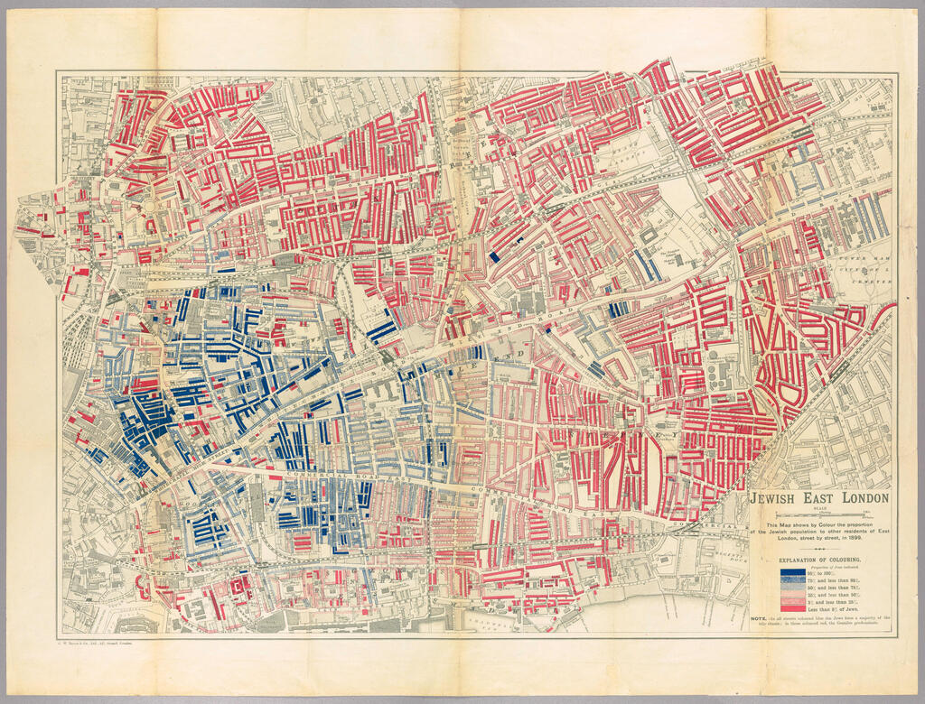
Antisemitic maps were also prevalent in the UK, where Jews faced persecution since the Crusades and were expelled in 1290 by King Edward I, barred for 360 years. Cultural depictions, from Shakespeare’s usurious Shylock to Dickens’ villainous Fagin, reflected deep-seated biases.
A 1901 map of East London by George Arkell, though not overtly antisemitic, described the “gradual spread of Jews” in terms evoking disease, using colors to instill fear, Segal described. “It presented Jews as a contagious social threat.”
According to Segal, Jews rarely produced contemporary maps until the early 20th-century Zionist movement, as their global, non-territorial identity didn’t lend itself to cartography.
He noted that Ze’ev Jabotinsky’s first Hebrew atlas used graphics to depict all peoples’ movements—Chinese, Indians, Africans, Jews and Europeans—normalizing Jewish migration as part of global patterns, unlike the exceptionalism in antisemitic maps.
Segal’s takeaway is clear: “Every map, even those appearing technical or scientific, is ideologically charged. Colors and borders aren’t neutral.” He pointed to maps of Israel that leave surrounding areas blank, as if nothing exists beyond. “We must critically examine what’s hidden beneath the guise of order and objectivity,” he urged.


