A little over a month into 2026, it is already clear which interior design trends are staying, which are on the way out and what will define our homes in the year ahead.
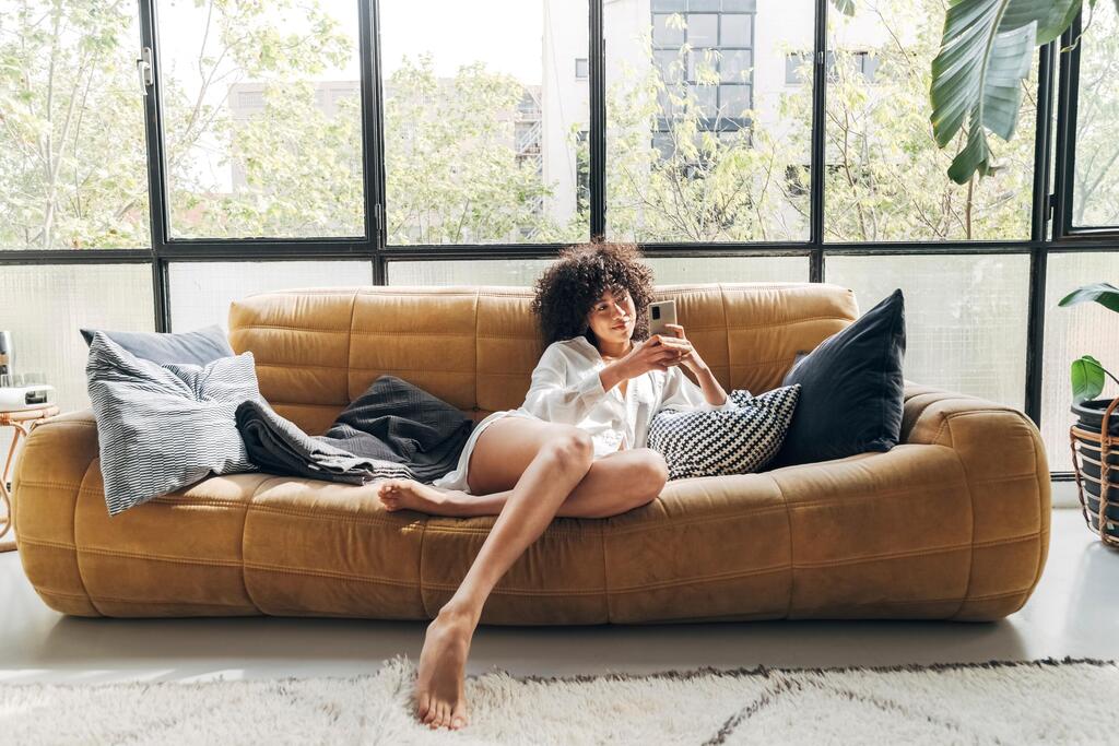
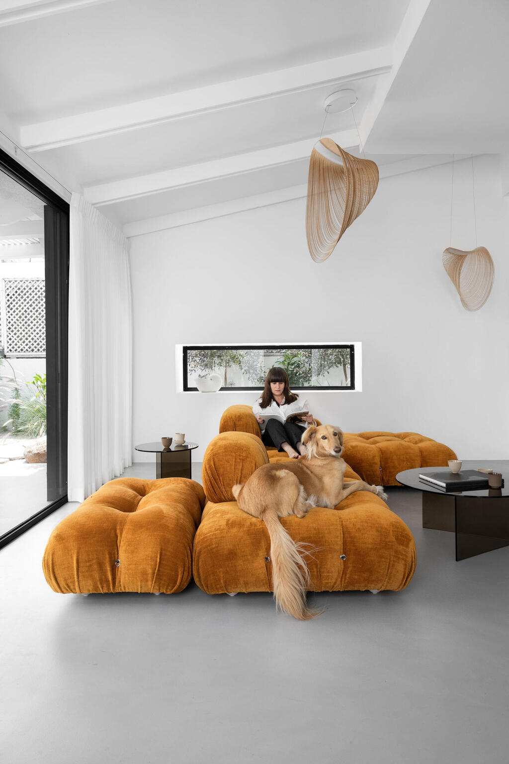
The most prominent shifts are expressed through form and color, and through the contrast created by layering textures and multiple shades of the same hue. The palette for 2026 evokes a warm, enveloping cave: camel, powder pink, blush, burgundy, coffee tones and moss green.
In practical terms, this signals a gradual move away from stark, sterile white toward a softer palette of natural, earth-inspired hues. This softness, inspired by nature, is reflected in wall and ceiling colors, substantial and inviting seating that feels grounded, unusually shaped armchairs and especially plush cushions. Soft lighting completes the atmosphere, setting the right frequency for calm.
13 View gallery
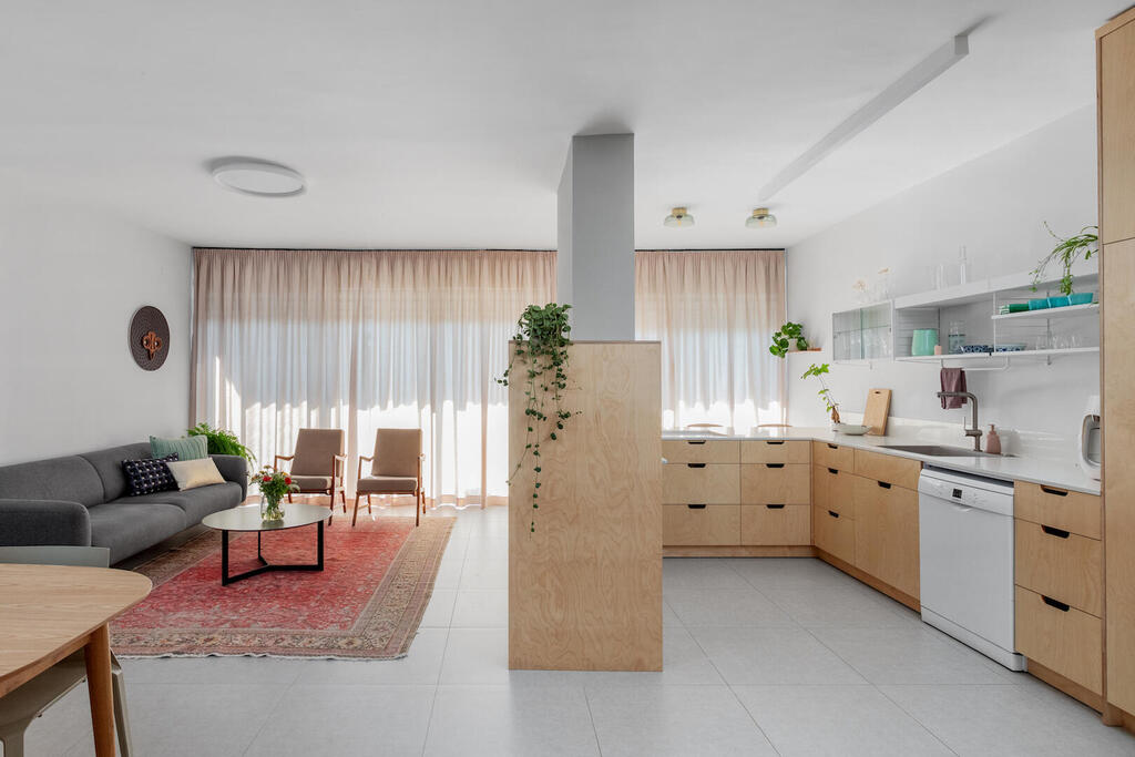

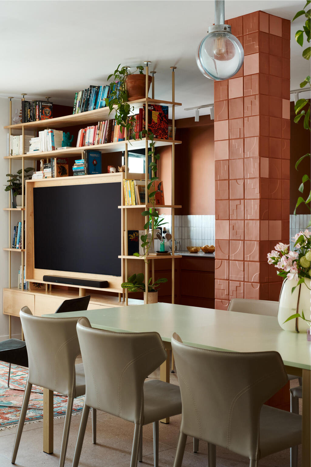
A partition defines the space, creating more intimate areas within the home
(Photo: Shiran Carmel)
13 View gallery
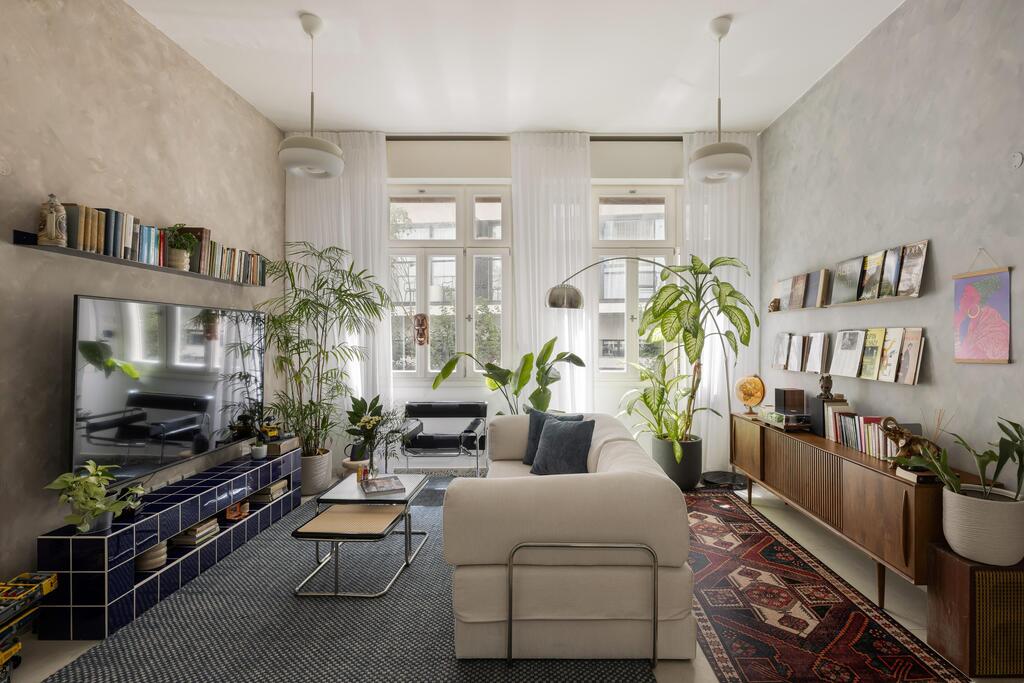

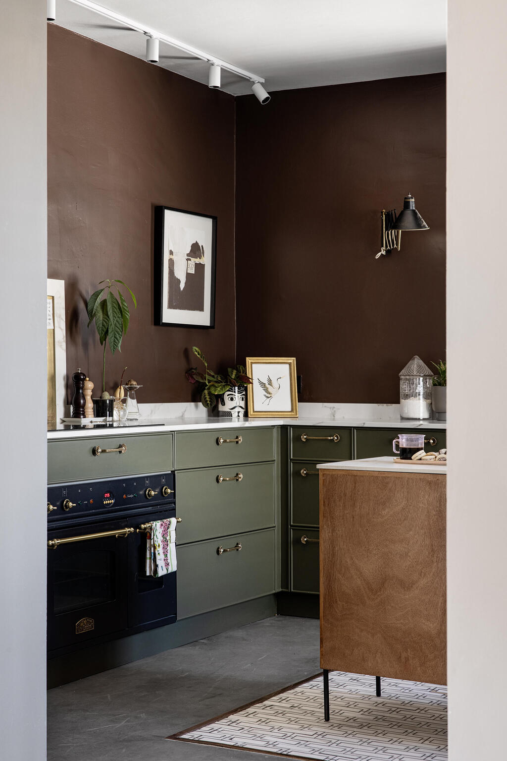
Stainless steel paired with warm tones softens the overall look
(Photo: Merav Felberg)
Here are the in and out trends for 2026
Form
Out: fully open-space layouts. The open space, rooted in modernist architecture, is not disappearing entirely, but there is a perceptible shift in how we perceive the home. As a protective space, it is harder to achieve that sense of refuge when all functions share one exposed expanse.
In: Soft divisions created by bookcases, partitions and architectural elements introduce intimacy and warmth. The search for a protective, cocoon-like home pushes the fully open space aside, making room for smaller, more secluded areas within the living space. As life outside feels increasingly intense and overwhelming, the desire for a quiet retreat at home grows stronger.
Out: overly rounded carpentry. Exaggerated rounded edges dominated social media and design magazines in recent years. While visually pleasing and comfortable, repetition has dulled their impact.
In: detailed woodwork. Distinct contemporary woodwork lies in subtle junctions and separations between elements, the grain and tone of the wood itself, and the interplay of panels arranged in varied configurations.
Color
Out: isolated pops of color. The era of a single accent wall or a bold armchair next to a gray sofa is fading. In its place comes a more harmonious space with a unified language and fewer standout elements.
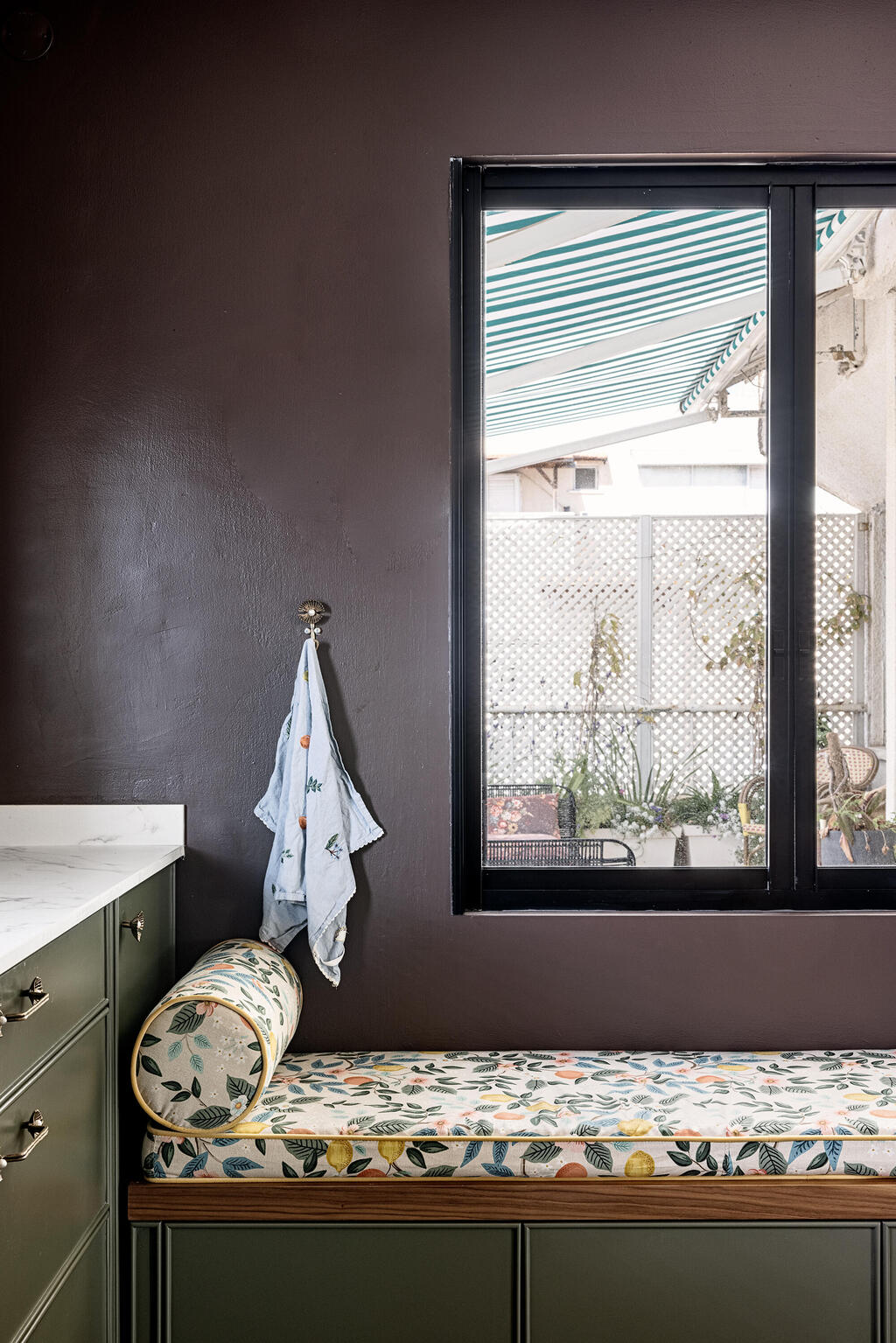
In: one color across multiple shades. Perhaps the most significant shift for 2026 is the use of a single hue that envelops an entire space, with varied tones and textures. Textiles may share a palette while contrasting in material, faux fur against sequins, linen against velvet. Walls might carry one tone, the ceiling a lighter variation, with sofas, armchairs, cushions and curtains continuing the chromatic sequence, often within a brown spectrum.
Out: color drenching. Painting every surface in a room, walls, ceiling, trim, doors and window frames, in the same or similar tone is losing momentum.
In: color capping. From the word “cap,” this approach paints four walls up to about seven-eighths of their height, while the upper strip and ceiling are finished in a different shade, creating a visual lid for the room.
Out: white ceiling. White ceilings have long been less a trend than a default driven by hesitation.
In: wall and ceiling in the same shade. This is the simpler choice for those who prefer not to layer multiple tones of a single color, as noted above. It is an ideal solution for anyone drawn to soft off-whites with a hint of mocha or powder, creating a pleasant, enveloping space.
Today’s water-based wall paints can be used on ceilings without issue, allowing the entire room to feel cohesive and wrapped in color rather than glaring in bright white.
The entrance into 2026 marks a clear move away from “millennial gray,” the cool urban neutral popular over the past decade, toward deeper, warmer browns aligned with Gen Z’s aesthetic. Born between 1997 and 2012, members of Gen Z are driving trends that seek comfort and emotional refuge in a world that feels fast and glaring.
13 View gallery
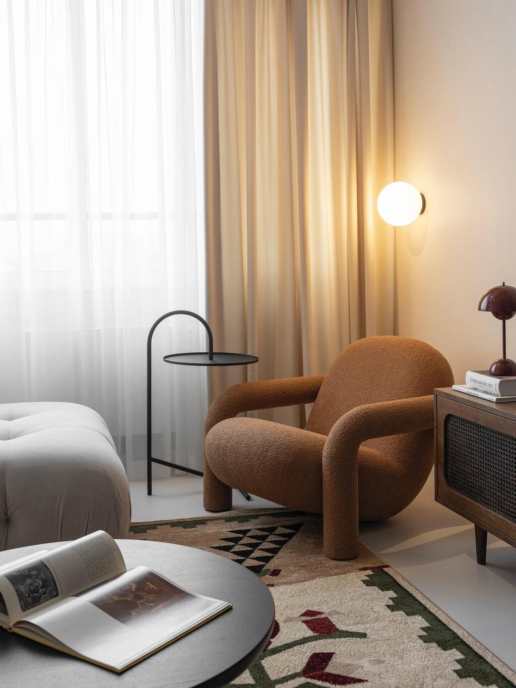

A brown bouclé armchair and soft wall lighting, both by Ukrainian brand Diza
(Photo: Courtesy of Prat Living)
Textiles and finishes
Out: slatted wood wall cladding. Wood remains central to home design, but the repetitive slatted look that dominated recent years is giving way to quieter, more integrated surfaces.
In: large wood panels. Broad, continuous surfaces feel architectural and serene. Partitions are gaining popularity, with wood used in a calm, uniform presence rather than in repetitive strips.
Out: white and cream bouclé. The beloved 1980s fabric made a strong comeback in recent years, appearing on sofas, cushions, armchairs and throws. But as 2026 begins, light bouclé already feels overused.
In: brown bouclé and textured fabrics. If bouclé remains, it appears in shades ranging from coffee and mocha to camel and burgundy, alongside linen, natural weaves and soft faux fur upholstery.
Out: the millennial gray sofa. Gray sofas became nearly ubiquitous over the past decade.
In: the Gen Z brown sofa. Chocolate, coffee or camel sofas now anchor living rooms, around which an entire palette of earth tones and varied textiles is built.
13 View gallery
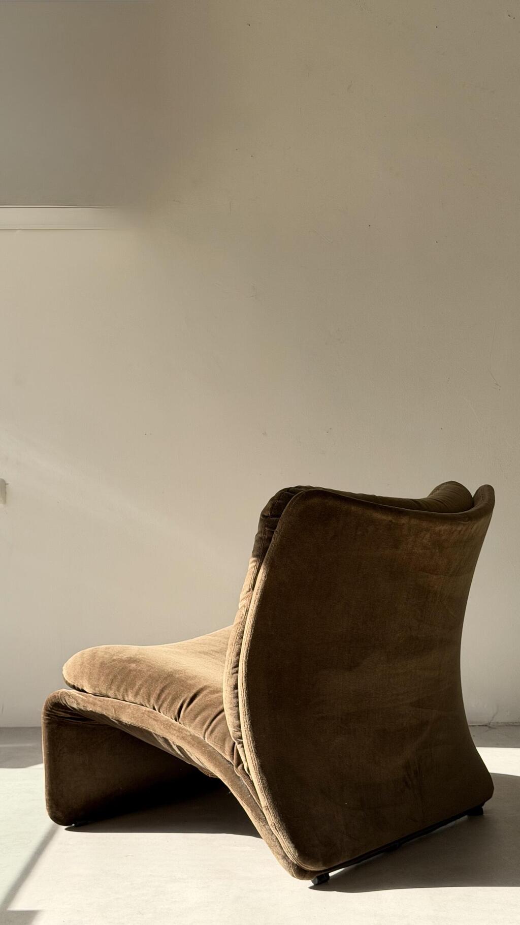

Back to brown: The 1970s Selene armchair by designer Adalberto Caraceni for B&T
(Photo: Avi Ben Ezra. Vintuch studio)
Out: yellowish oak veneer. Oak has been a dominant material for more than two decades, in kitchens and parquet flooring alike. As brown tones rise, the yellow-tinged oak look recedes.
In: deep walnut veneer. Rich walnut color reinforces the cave-like warmth of the contemporary home. Those who prefer oak can opt for deeper, less yellow finishes.
Out: white kitchens and gray marble. While bright white will never disappear entirely, the emphasis is shifting toward kitchens with greater depth and warmth toward richer brown tones.
In: smoky, natural hues. Browns and greens blend harmoniously with walnut and light oak veneers, combining wood textures with colors drawn from nature.
13 View gallery
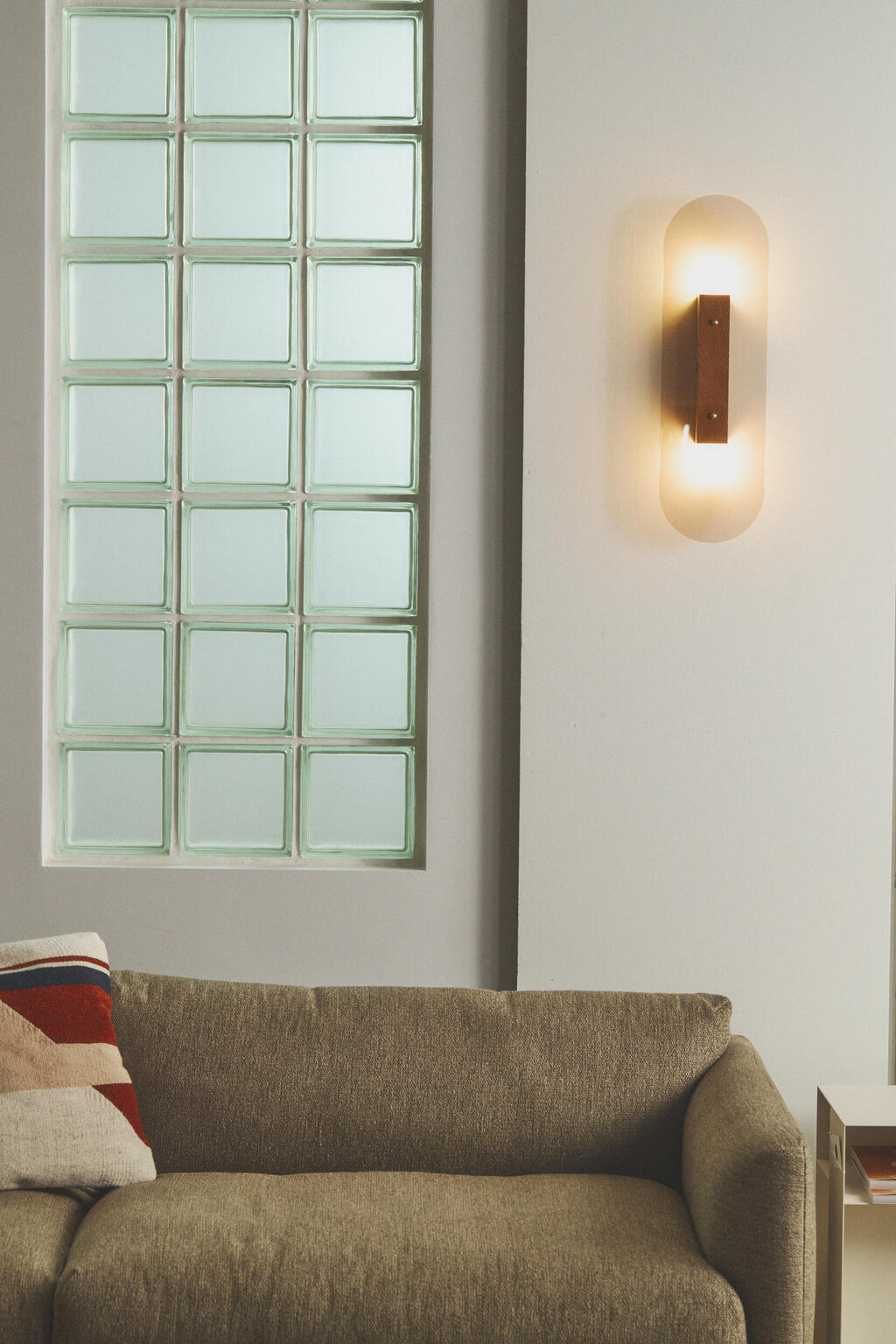

Small light fixtures placed at mid-wall height create a soft, inviting atmosphere
(Photo: Pavel Zubenko )
Accessories and lighting
Out: strong central lighting. Task lighting remains essential for cooking and dining, but it should yield to a softer atmosphere in the evening.
In: layered, soft lighting. Scattered fixtures in living rooms and bedrooms create depth and highlight favorite corners and objects. For a calming effect, designers recommend LED bulbs of 3 to 5 watts in the 2700K to 3000K range.
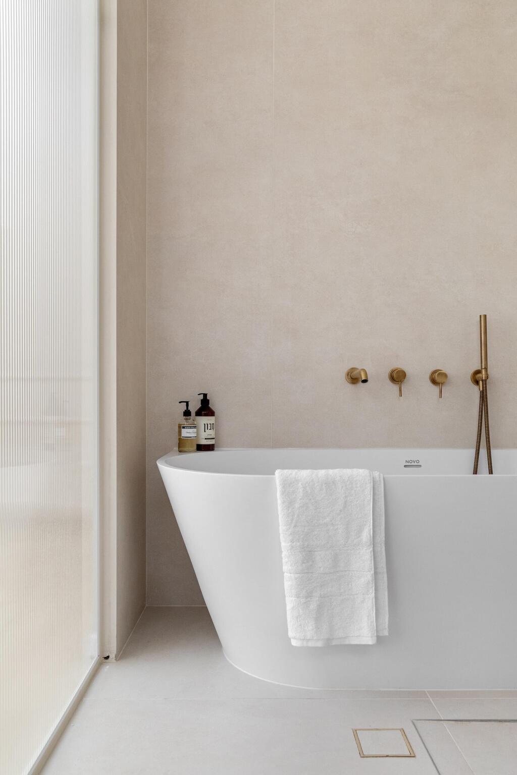
Out: black faucets and metal hardware. As high-contrast elements lose favor, black taps and handles are giving way to softer metal tones.
In: copper and rose gold finishes. These metals integrate naturally with warm palettes and do not dominate the space the way black does.
13 View gallery
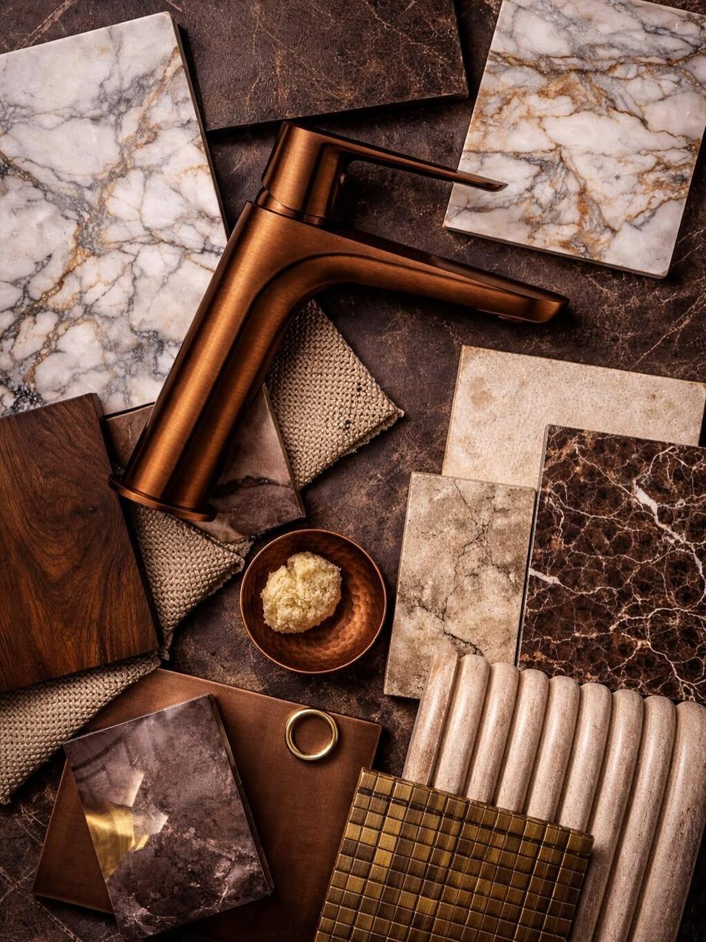

Instead of a black faucet: a copper tap with a special finish that prevents discoloration, by Italian company Icrolla
(Photo: Courtesy of Boutique Ceramic)
Out: rough wrought iron with a rustic finish. With rich textures already present in textiles, smoother, more contemporary finishes provide balance.
In: Stainless steel and iron in clean finishes with rust tones. These materials create a precise counterpoint to rich fabrics such as velvet, bouclé and synthetic fur.
13 View gallery
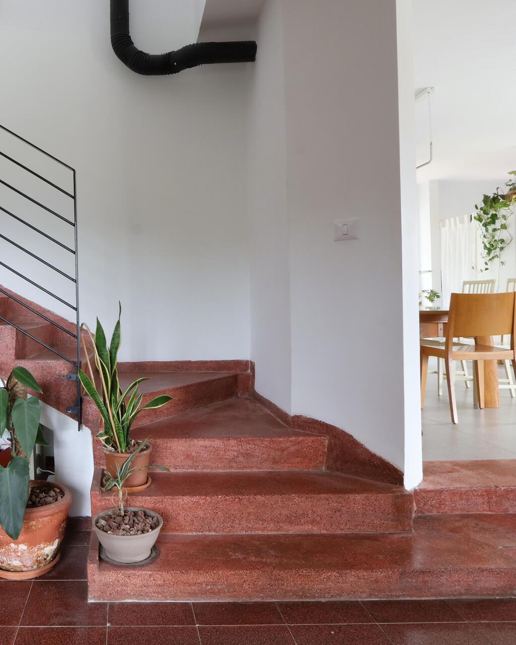

The rich color palette of the 1970s and 1980s makes a comeback, with the preservation of a reddish terrazzo floor
(Photo: Liron Hen Gonen)
In 2026, the home reclaims its role as a warm, intimate refuge. Earth tones such as brown, green, burgundy and powder pink establish a continuous, cohesive language. Sheltered, indulgent corners, sofas and armchairs in varied textures of the same hue, understated carpentry and cladding, and soft, diffused lighting all come together to create a calming atmosphere rooted in nature. The bold tones of the past decade are giving way to ease and comfort.


