


Some colors simply come into fashion. Others seem to capture something about the moment. Transformative Teal belongs to the second category.
The deep, sophisticated shade sits somewhere between blue and green, with the richness of dark turquoise. International trend forecasting agency WGSN and color system Coloro named it their Color of the Year for 2026, and it is already appearing across interiors, furniture, fashion and social media.
The appeal is partly visual. Transformative Teal sits somewhere between ocean and forest, combining the depth and stability associated with blue with the vitality and connection to nature associated with green. WGSN has described it as a “fluid fusion” of dark blue and aquatic green.
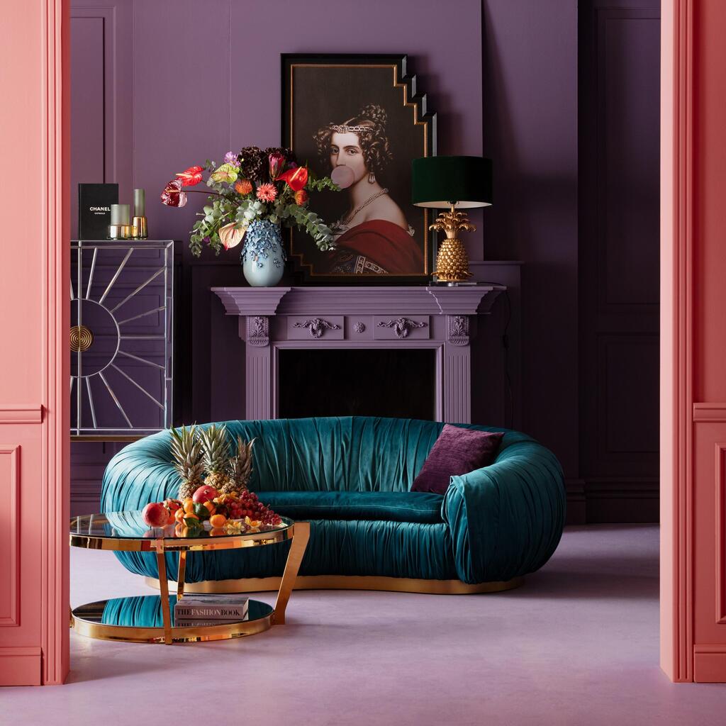
But the choice is also meant to reflect a broader mood. WGSN and Coloro view 2026 as a period of transition, uncertainty and changing direction. Transformative Teal is intended to embody both sides of that tension: it feels calming and grounded in nature, yet also distinctly contemporary and almost futuristic.
It is, in effect, a color meant to suggest change without giving up a sense of stability. That makes it a far more assertive choice than Pantone’s muted Color of the Year, Cloud Dancer.
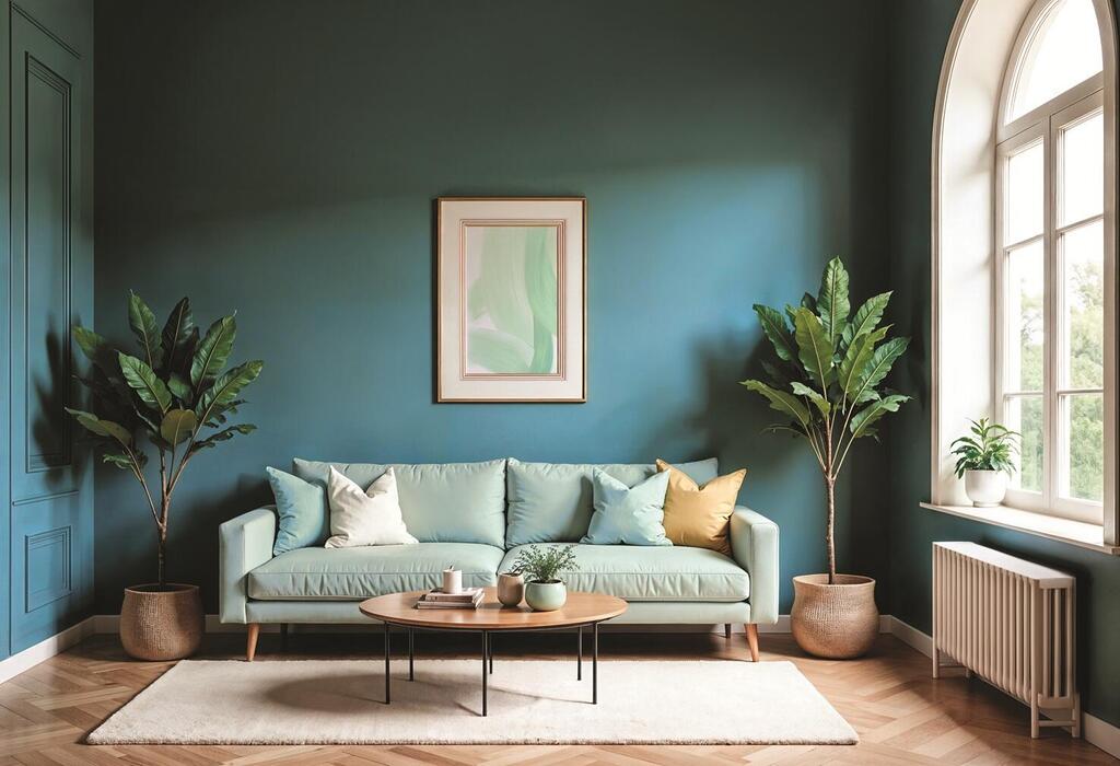
Transformative Teal, with a similar shade also available in Israel's Nirlat’s color palette
(Photo: Shutterstock)
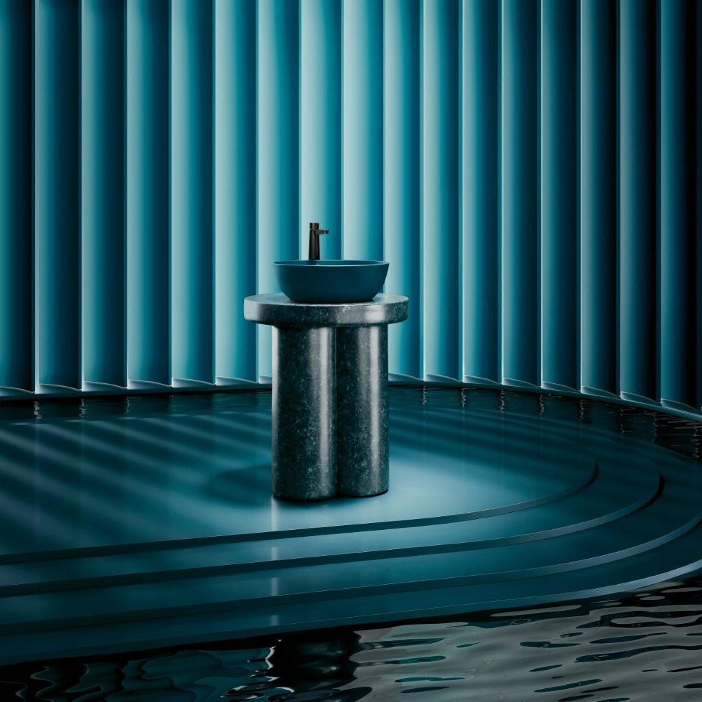
Neither blue nor green: Villeroy & Boch wall coverings and bathroom fixtures, available exclusively at Negev
(Photo: Courtesy of the brand)
After years of beige, color returns
For years, interiors have been dominated by white, cream, beige, gray and greige, part of a broader preference for restrained, neutral spaces. Now the pendulum appears to be moving in the other direction.
Design magazine Livingetc has identified a shift in 2026 toward richer, more dramatic kitchens and interiors, with teal among the shades replacing sterile, nearly colorless minimalism.
American interior designer and blogger Emily Henderson, who has more than a million Instagram followers, has also highlighted teal as a color worth watching.
After years of pale, softened versions of blue and green, she argues, homeowners are becoming more receptive to complex, saturated shades. Teal offers both colors at once, and its increasing use in permanent features such as tiles and cabinetry could help it outlast a short-lived trend.
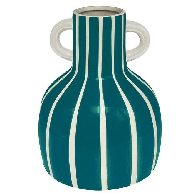
Colorful designer vase, available at Max Stock
(Photo: PR Max Stock)
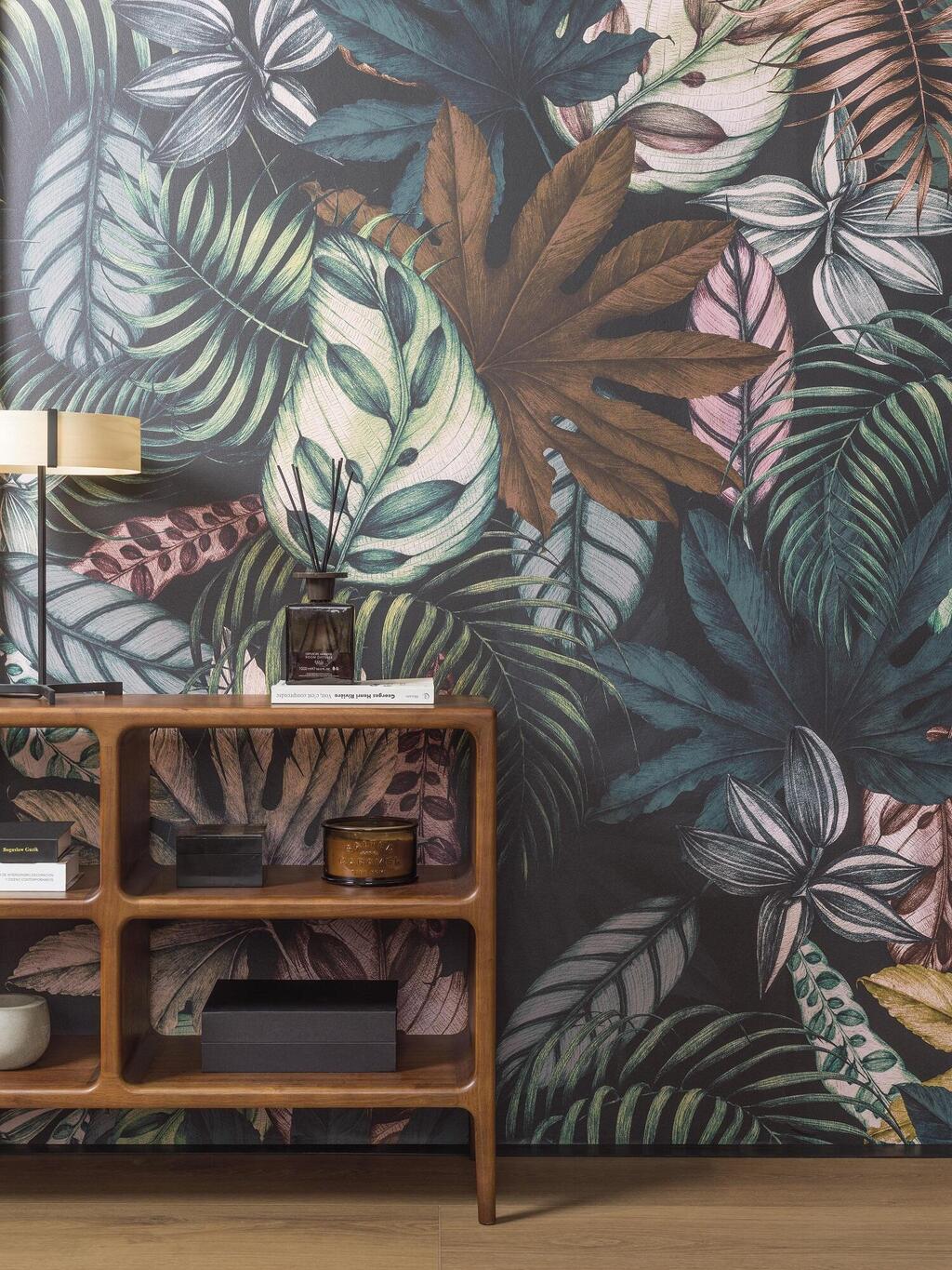
Pairs well with both cool and warm tones. Wallpaper by Porcelanosa
(Photo: Courtesy of the brand)
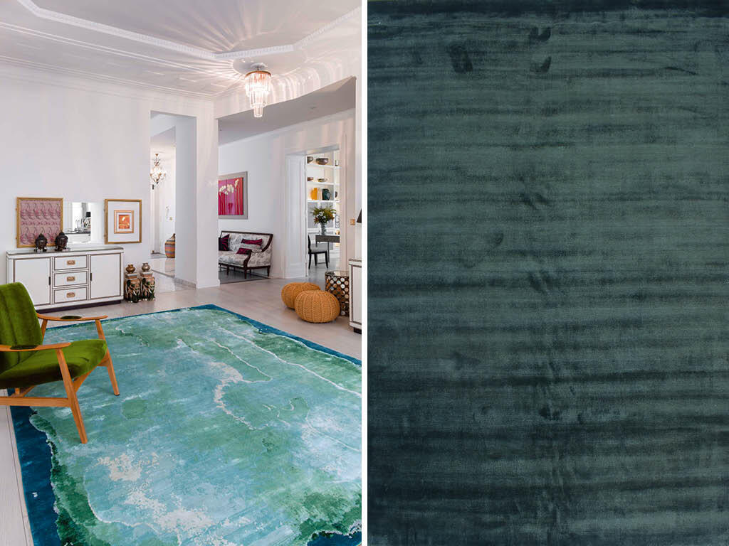
Rugs by Rug Star and Tzemer Carpets
(PhotoS: Courtesy of the brands)
More than an accent color
Transformative Teal is bold, but it does not necessarily overwhelm a room. Designers are using it across kitchen cabinetry, tiles, wall coverings, sofas, curtains, bedding and walls, as well as in smaller decorative pieces.
Interior designer Anne Marie Boedges recommends combining it with warm wood, brass and cream, particularly on accent walls, cabinetry and textiles.
In the kitchen, deep teal cabinets paired with pale stone, oak and brass hardware can create a space that feels rich without becoming heavy.
British interior designer Kate Guinness, quoted by Livingetc, has also recommended using teal on cabinetry against neutral walls and classic stone such as Carrara marble. Bathrooms are another natural setting for the shade. Its blue-green character already evokes water, allowing it to work easily across tiles, vanities, sinks and even bathtubs.
A new trend with a nostalgic streak
Despite its futuristic name, Transformative Teal is hardly new. Henderson has noted that similar shades were popular around two decades ago, when they were often described as peacock blue.
This time, however, the color is returning in a deeper and more sophisticated form. That flexibility is part of its appeal. Combined with dark wood and brass, it can take on a retro or Art Deco character. Against stone and concrete, it looks distinctly modern. Paired with pink, yellow or brighter shades, it can feel younger and more playful.
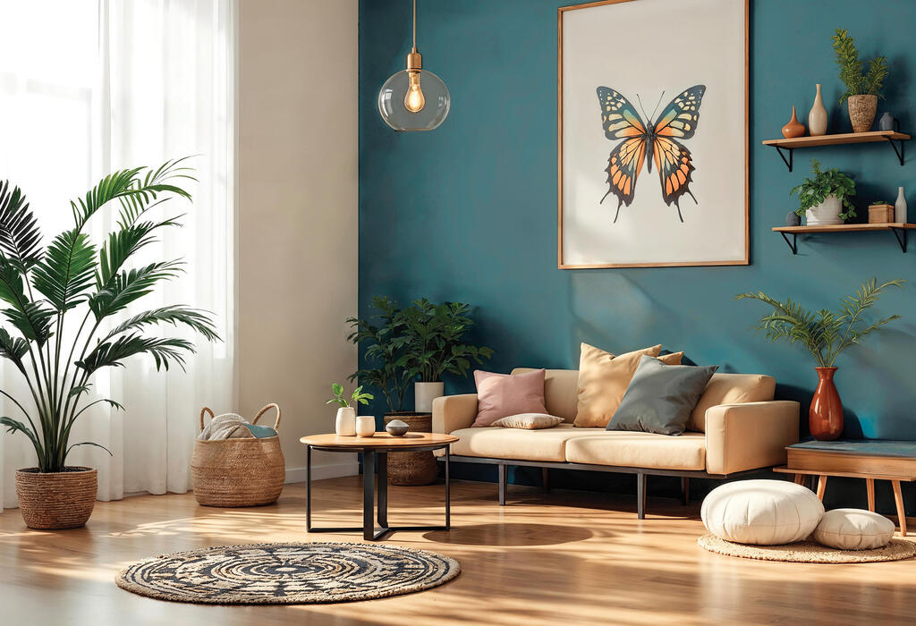
Transformative Teal, with a similar shade available in Nirlat’s color palette
(Photo: Shutterstock)
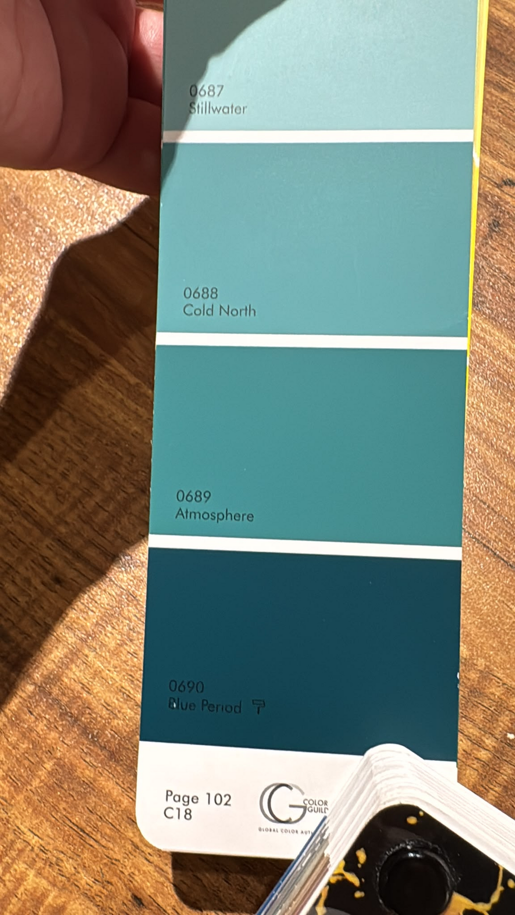
Ready to embrace now: Nirlat color palette
(Photo: Courtesy of the brand)
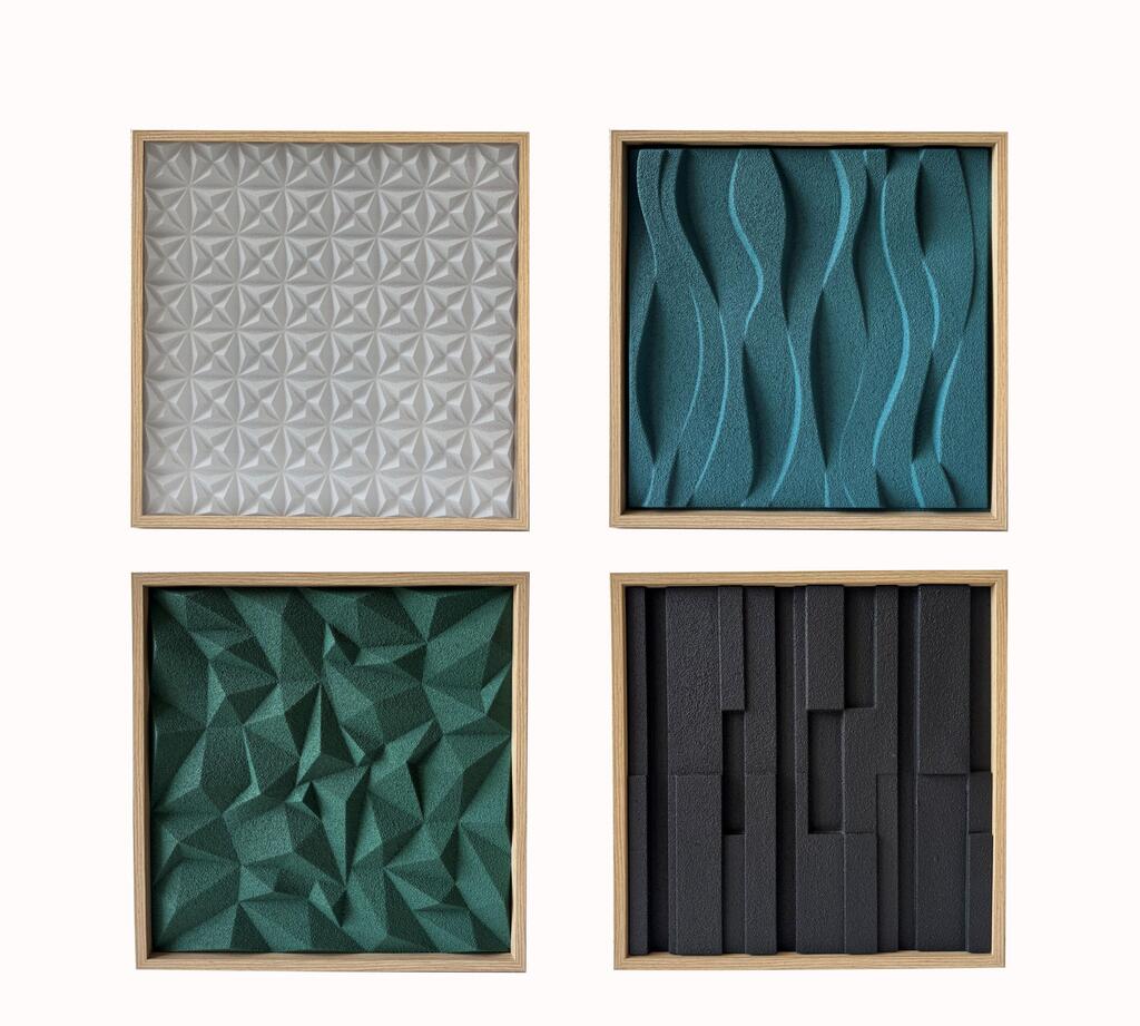
Decorative wall art, available at Max Stock
(Photo: Max Stock PR)
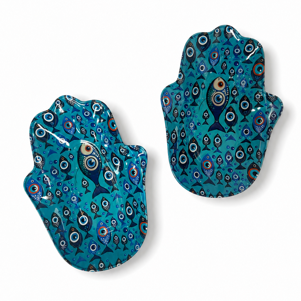
Suited to the Mediterranean climate and atmosphere. Pair of stainless-steel hamsa dishes, available from Haida
(Photo: Courtesy of Haida)
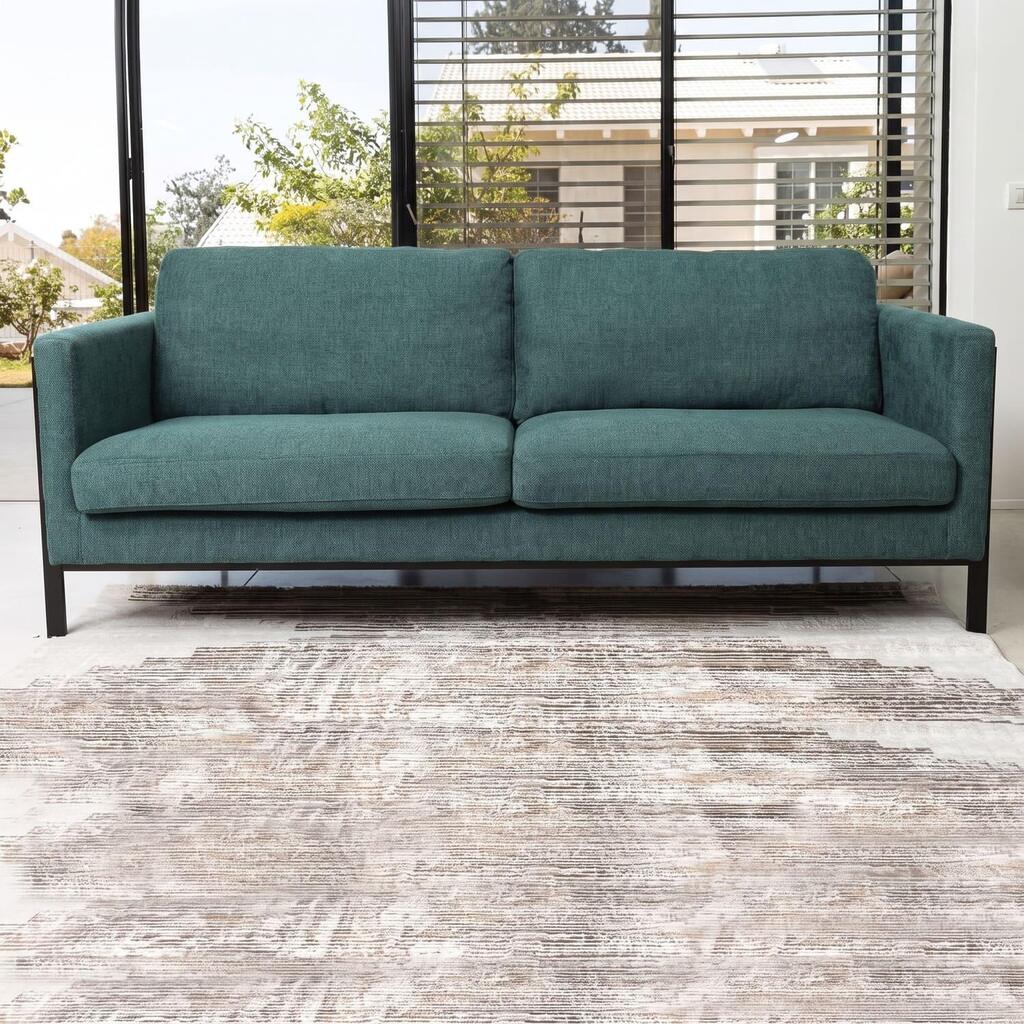
Color adds depth and richness to the space. DESTINY three-seat sofa by Napo
(Photo: Dag HaZahav PR)
Why it suits Israeli homes
The shade may be particularly well suited to Israeli interiors. At a time when the home increasingly functions as a place of refuge from stress and uncertainty outside, designers are looking for colors that feel calm and enveloping without becoming bland.
Deep blue-green tones also respond well to Israel’s strong natural light, creating a sense of visual coolness without feeling overly bright.
They pair easily with materials already common in local interiors, including natural wood, stone, exposed concrete, brass, copper and greenery.
Entrepreneur and trend analyst Gil Royter says Transformative Teal reflects changes that extend far beyond the design world. “In my view, the choice of Transformative Teal as a leading shade for the spirit of the times is no coincidence,” he said. “While international trend forecasting organizations such as WGSN and Coloro identified it through fashion and industrial design, its depth is rooted in much broader social, economic and geopolitical changes.”
“We are living in an era of fluidity and transition, dealing globally with climate change, economic instability and geopolitical upheaval that undermine our basic sense of security. At the same time, the development of artificial intelligence and an increasingly digital reality are blurring the boundaries between the real and virtual worlds.”
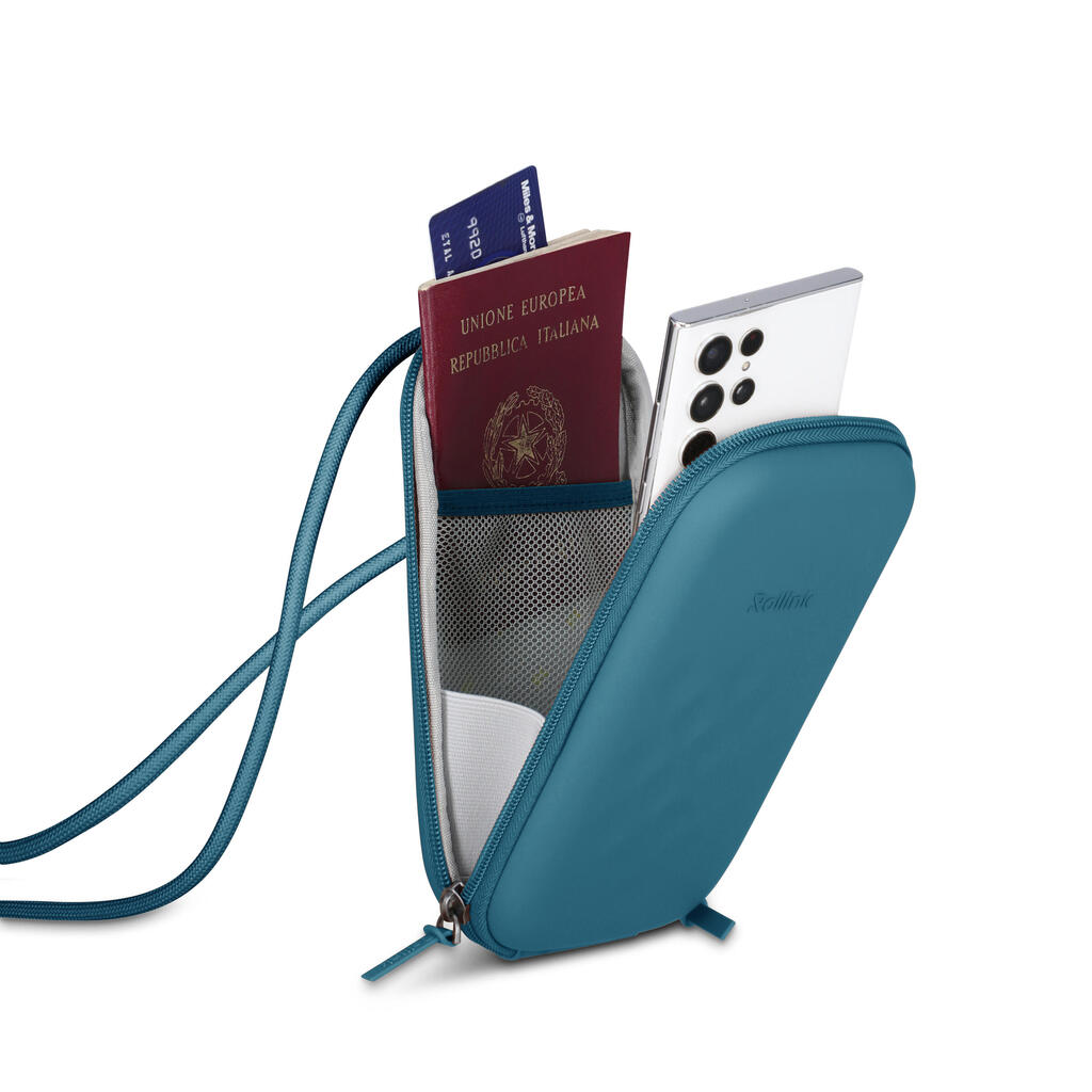
The inspiration also comes from fashion and accessories. Rollink Nano Case phone bag
(Photo: Dag HaZahav PR)
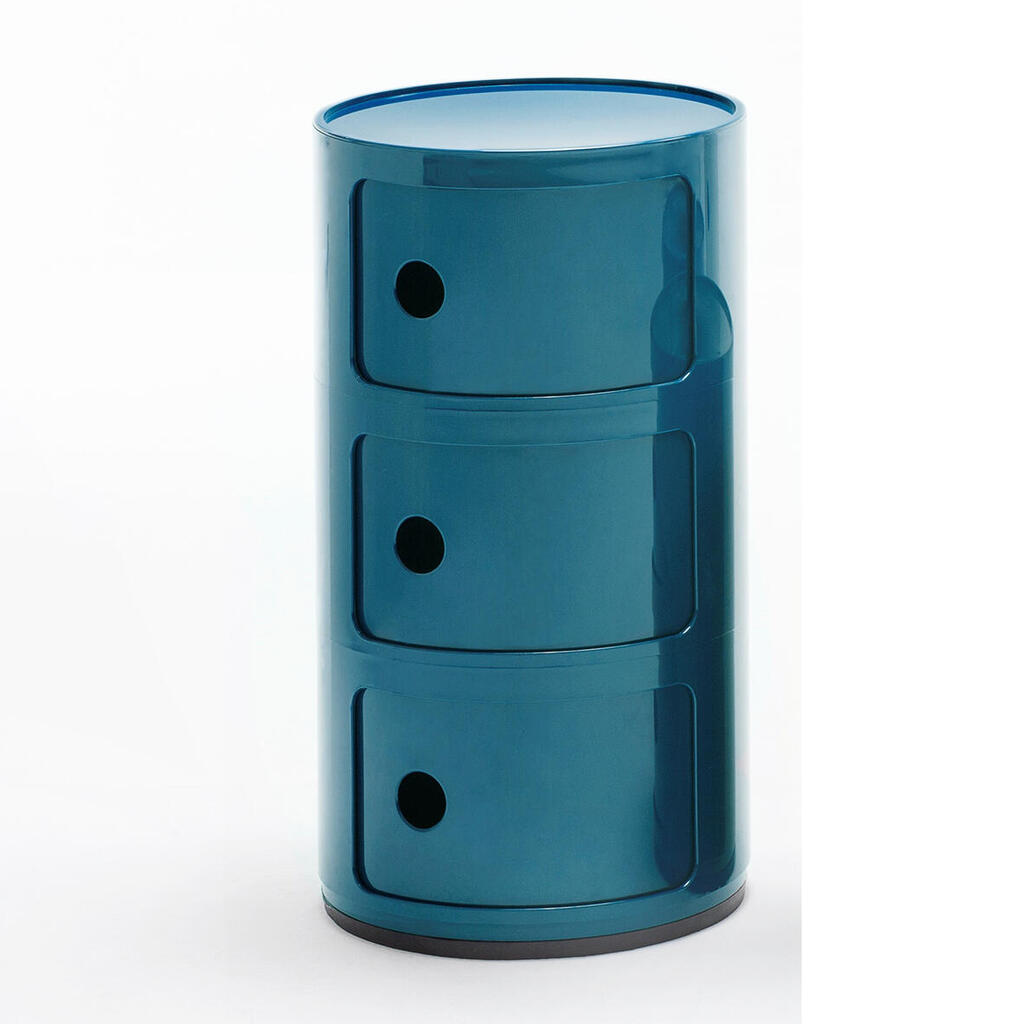
Kartell Componibili storage unit, available at Habitat
(Photo courtesy of Kartell)
According to Royter, the shade sits directly at that intersection. Blue conveys calm, stability, technological depth and trust, while green represents growth, renewal and the desire to reconnect with nature.
“Unlike soft pastel shades that offer an ‘escape,’ teal is deep, present and powerful,” he said. “It provides a sense of grounding, focus and inner resilience, exactly what the modern consumer is looking for in the private space as a counterweight to external stress.”
Sharon Leshem, head of the architects division at Israeli paint company Nirlat, sees another advantage: the color works particularly well with the local climate.
“When it comes to translating the trend into the local lifestyle, Transformative Teal brings something refreshing and full of depth: it suits both the climate and the Middle Eastern spirit,” she said.
“In the Israeli climate, characterized by strong sunshine and intense daylight, deep teal shades function as a kind of visual oasis. They absorb some of the glare from outside, create a pleasant sense of enclosure and bring a calming, elegant feeling of coolness into the home.”
Leshem recommends using the shade in bedrooms, home offices and bathrooms, where it can help create a more intimate and focused atmosphere. In living rooms and dining areas, it can be used more selectively as an accent wall, or more extensively for a dramatic, enveloping effect.
The choice of materials can also change its character. Warm woods such as oak and walnut, along with wicker, soften the coolness of the blue-green tone. Natural stone, exposed concrete, terracotta, linen and textured cotton can add warmth and depth.
Brushed brass, copper and matte gold can push it in a more luxurious direction while subtly reflecting light around the space.
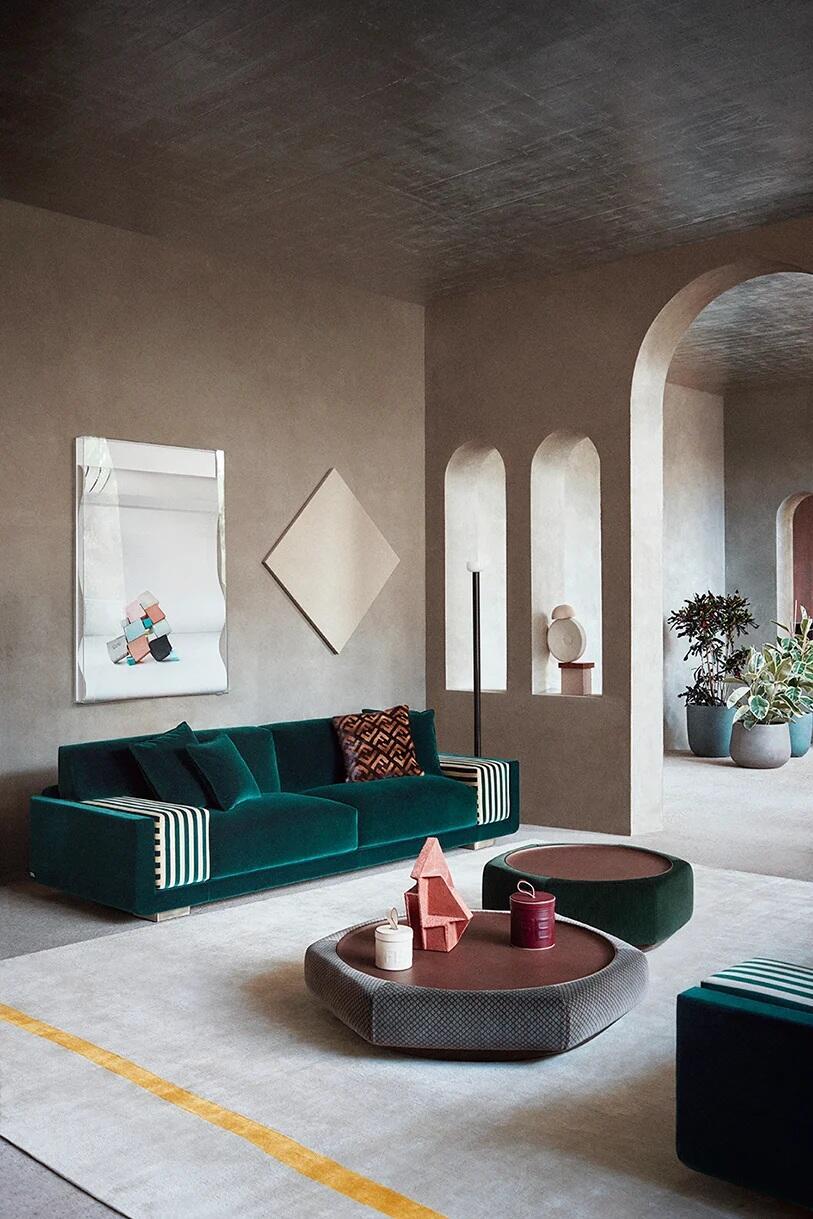
Sofa by Fendi Casa, available at Pitaro Hecht
(Photo: Courtesy of FENDI CASA)
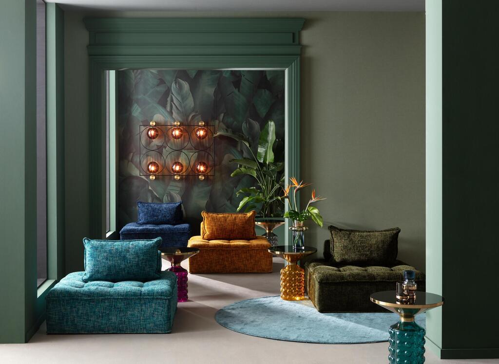
Sofa, accessories and armchairs by Kare
(Photo courtesy of Kare International)
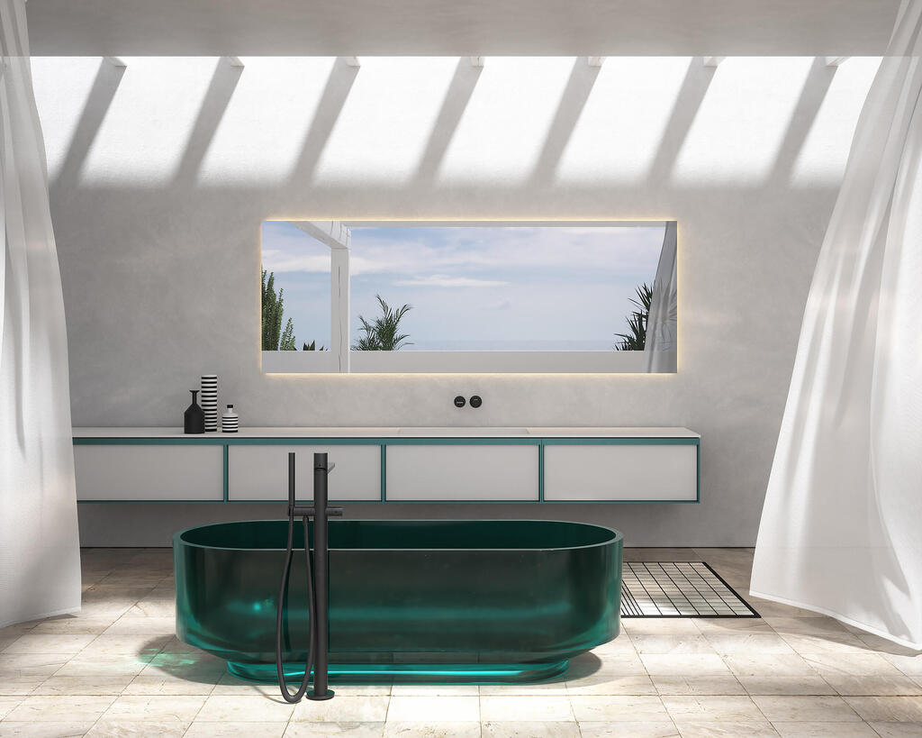
Bathtub by Antoniolupi, available at HeziBank
(Photo courtesy of Antoniolupi)
WGSN and Coloro have already announced their Color of the Year for 2027: Luminous Blue. The vivid, deep shade recalls lapis lazuli and carries a more dramatic presence than Transformative Teal.
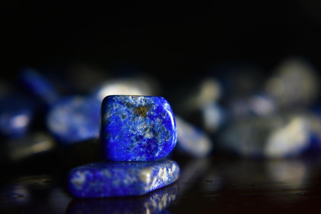
Lapis lazuli, the shade expected to take center stage in home design next year after teal
(Photo Pesh Siri, Shutterstock)
According to the forecasters, it reflects another meeting point between opposites: past and future, nature and technology, physical and digital life, rationality and spirituality.